Pastel hair colors have taken over social media, but not all shades live up to the hype. What looks dreamy on Instagram might turn into a nightmare in your bathroom mirror. Before you commit to that cotton candy transformation, let’s explore which pastel hues fall flat and which ones actually exceed expectations when you step into the real world.
1. Pastel Pink Gone Wrong
Pastel pink often fades to a sad, washed-out salmon color after just a few washes. The maintenance is brutal – you’ll need weekly toning treatments to keep it looking fresh.
Most formulations grab unevenly on previously bleached hair, creating patchy results that look nothing like those perfect Instagram photos.
Related: -21 Stunning Ways to Rock Gray Hair After Ditching the Dye
2. Lavender That Loses Luster
Lavender hair looks magical in professional photos but quickly transforms into a gray-ish mess. The purple pigments are the first to wash out, leaving behind an unflattering dingy tone.
Even premium brands can’t prevent this shade from looking tired and dull after about two weeks of regular washing.
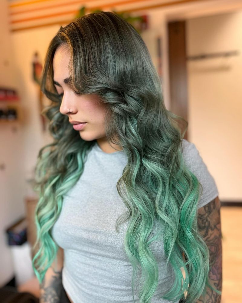
3. Mint Green Mishaps
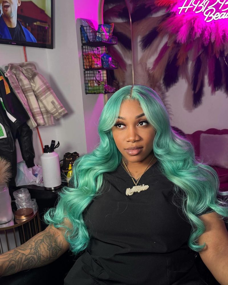
Mint green requires intensely bleached hair to look vibrant, which most stylists won’t achieve in one session. The result? A murky, yellowish-green that resembles algae rather than fresh mint.
The color oxidizes quickly, often turning an unflattering shade of swamp within days.
4. Baby Blue Letdowns
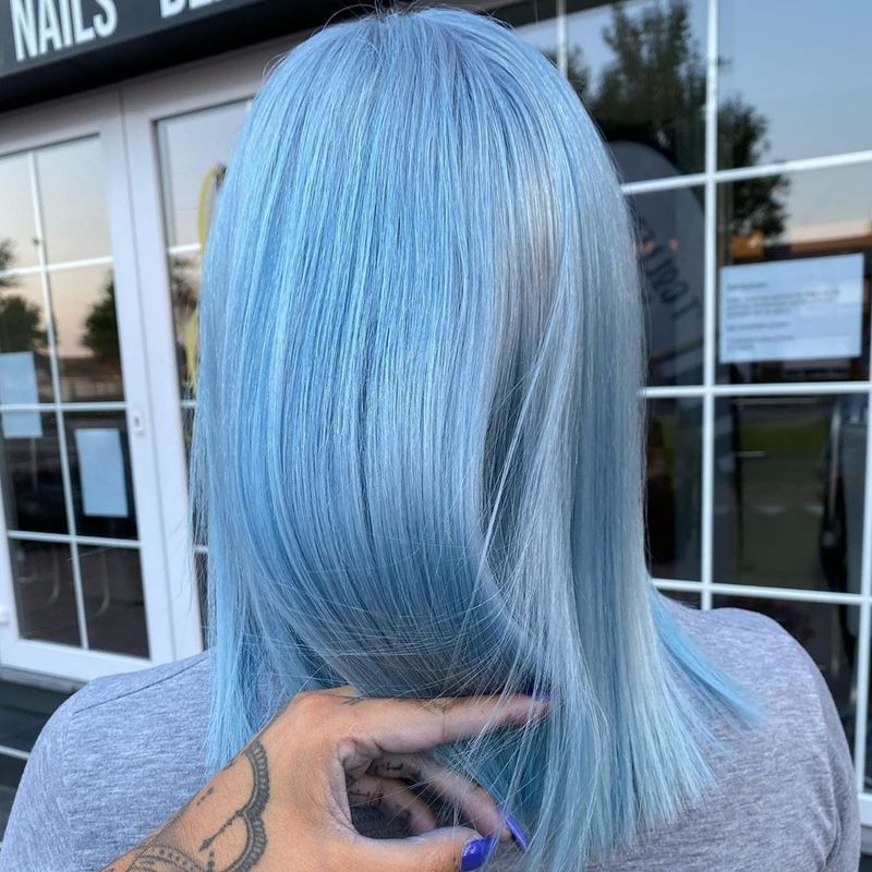
Baby blue seems perfect in theory but develops a greenish cast when it fades – especially if your hair had any yellow tones before application. The color vanishes after just 3-4 washes.
Most formulas stain everything from pillowcases to shower tiles while barely staying put on your actual hair.
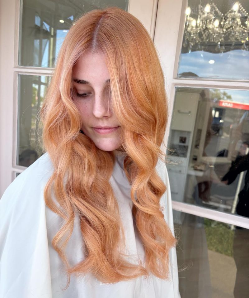
5. Peach Problems
Peach fades faster than almost any other pastel shade. What starts as a gorgeous sunset hue quickly turns into an unflattering brassy orange that looks more like a color correction gone wrong.
The warmth in peach tones brings out redness in most skin tones, creating a feverish appearance many clients hate.
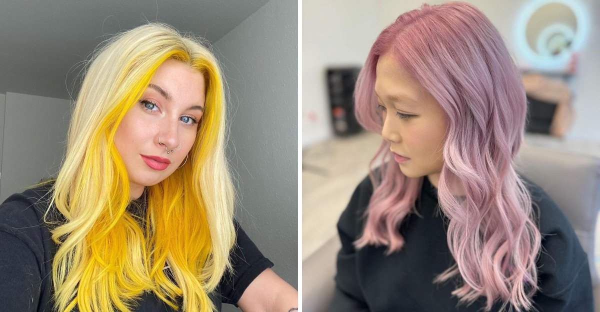
6. Lemon Yellow Letdowns
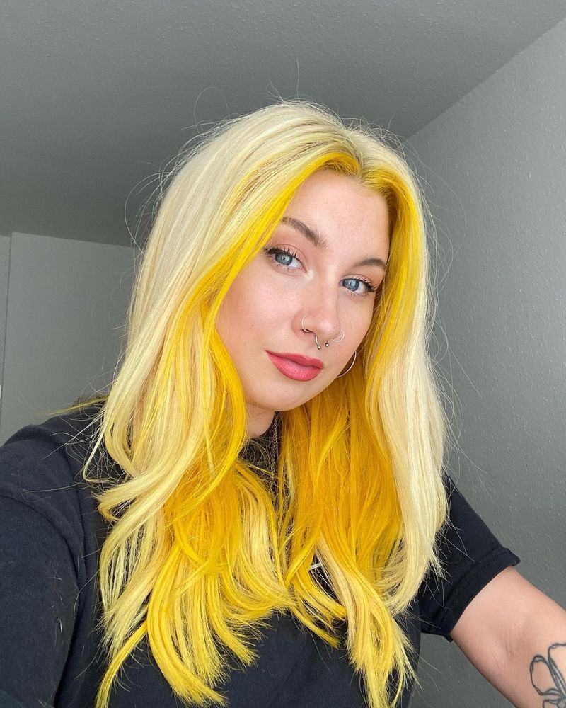
Pastel yellow photographs beautifully but resembles grown-out bleach in person. The shade is nearly impossible to achieve evenly on most hair types, resulting in patchy, highlighter-like sections.
Yellow pastel requires pristine white hair as a base, making it damaging and ultimately disappointing for most clients.
7. Silver Struggles
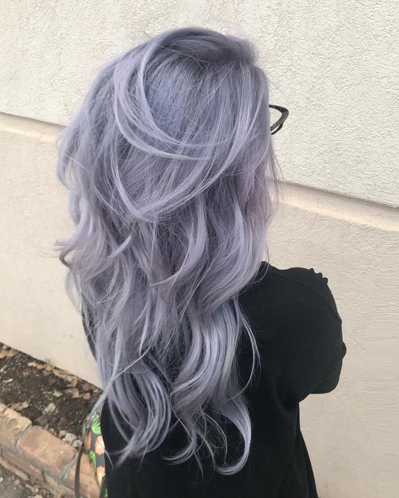
Silver pastel requires perfect application and extraordinary maintenance. Most attempts end up with purple patches or yellow streaks that ruin the mercury-like effect everyone wants.
Hard water instantly turns this shade brassy, making it nearly impossible to maintain for anyone without salon-grade shower filters.
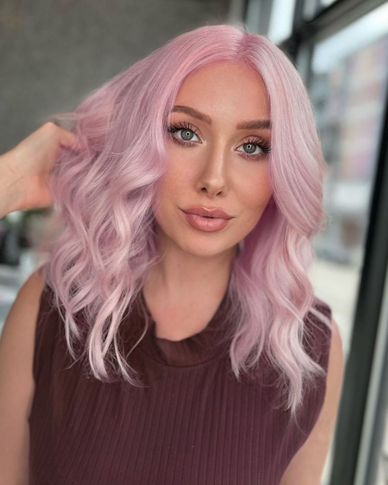
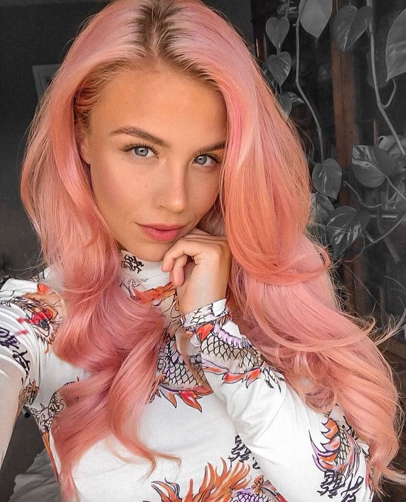
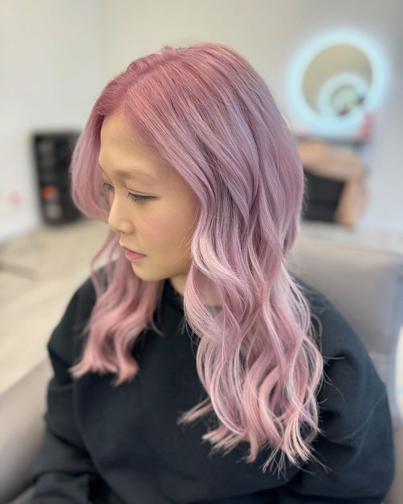
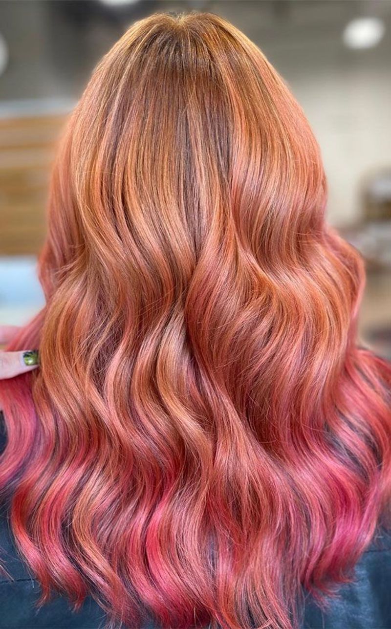
8. Rose Gold Radiance
Rose gold actually fades beautifully, softening into a flattering peachy-pink that complements most skin tones. The warm undertones make this shade forgiving on hair that isn’t perfectly bleached.
Even as it washes out, rose gold maintains its dimensional quality, looking intentional rather than neglected.
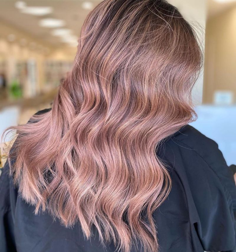
9. Dusty Mauve Magic
Dusty mauve looks even better in person than in photos. The subtle purple-pink balance creates dimension that cameras often miss, giving hair movement and depth.
This shade fades gracefully into a soft neutral that works with most wardrobes, making it surprisingly practical for a fashion color.
10. Smoky Blue Brilliance
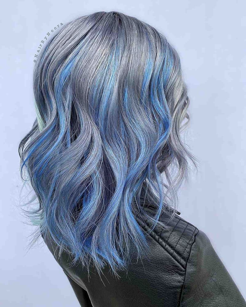
Smoky blue has depth that standard pastels lack. The grayish undertone makes it appear more expensive and intentional in real life, while photographs often flatten its complexity.
This shade actually improves as it fades, developing a lived-in quality that looks editorial rather than unkempt.
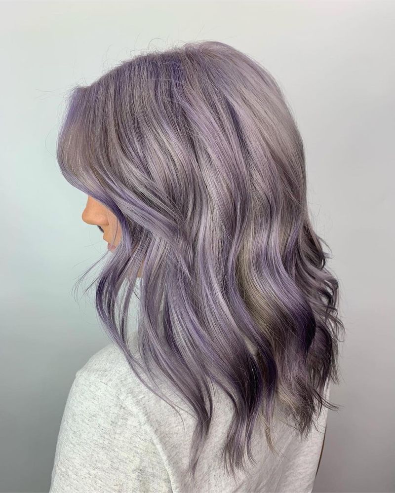
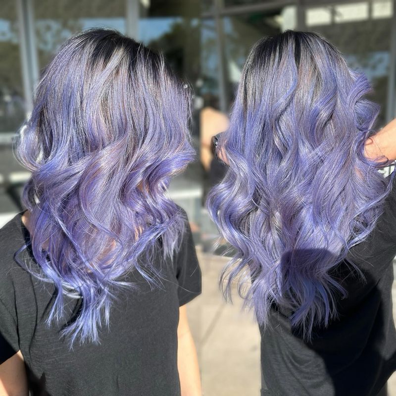
11. Lilac Loveliness
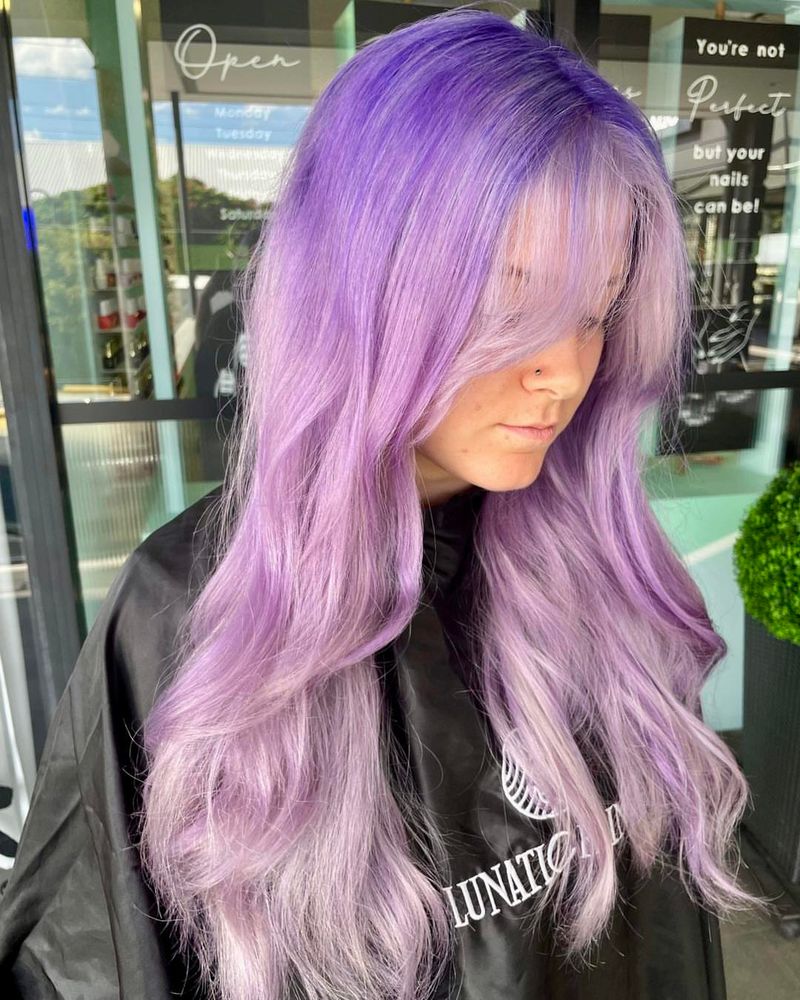
Properly formulated lilac contains both warm and cool tones that create fascinating dimension in changing light. While photos capture it as flat purple, real-life movement reveals its complexity.
Lilac fades to a flattering soft lavender-gray that continues looking intentional weeks after application.
12. Apricot Appeal
Apricot pastel contains subtle golden reflects that cameras rarely capture accurately. In person, these highlights create a sun-kissed effect that’s incredibly flattering on most skin tones.
Unlike other warm pastels, apricot fades evenly without developing harsh brass tones, maintaining its charm throughout its lifespan.
13. Pistachio Perfection
Pistachio green has a muted quality that photographs poorly but looks sophisticated in person. The subtle balance of blue and yellow creates a complex shade that changes beautifully in different lighting.
This understated green works surprisingly well with most skin tones, unlike the harsher mint variations.
14. Muted Coral Charm
Muted coral contains both warm and cool pigments that create fascinating dimension cameras struggle to capture. The balance of pink and orange creates a universally flattering shade that enhances most complexions.
This color actually develops more character as it fades, unlike most pastels that just look washed out.
15. Periwinkle Promise
Periwinkle blue-purple looks even more magical in motion than in static images. The color shifts between lavender and baby blue depending on lighting, creating an enchanting effect no photo can truly capture.
This shade actually looks more vibrant in natural light than under salon fluorescents where most reveal photos are taken.